
Practical Sales Training™ > How to connect with your buyer > The Traffic Light Effect

The Traffic Light Effect
What Is It
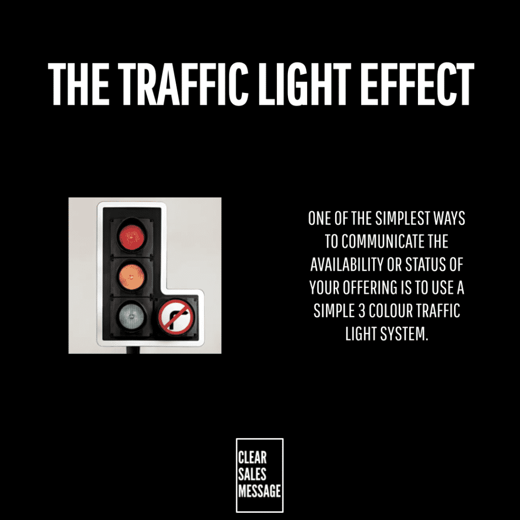
The Traffic Light Effect is all about using traffic light colours to communicate the availability or condition of your offering. A colour, doing the job a whole sentence would otherwise need.
Most buyers scan rather than read closely. A colour gets processed before a single word does.
That speed is exactly what makes this effect so useful anywhere a quick decision matters.
Why Does It Work
It works because of semiotics. We use images to interpret meaning, and it’s widely understood and accepted that red means stop, amber means prepare to stop, and green means go.
These concepts can then apply to the stock level or condition of your offering, to quickly and simply communicate with buyers or clients.
Nobody needs to learn a new system. The meaning already lives in every buyer’s head, from years of seeing it on the road.
How Can You Use It
Apply the colours to a real, changing status
If you have to communicate the availability of a resource, or the condition of something, consider implementing a simple traffic light system to do so.
Define what each colour means for your offering
Whilst red, green, and amber are recognised for what they represent, you may also choose to clarify their meaning if it’s relevant to your offering. For example, amber might mean 10 to 50 units in stock, whereas red might mean less than 5 units in stock.
Layer it with other systems if you need more detail
Depending on the complexity of your offering, you may also wish to use a colour coding system or product codes too.
When It Works Best
This works best when availability or condition genuinely changes over time, stock levels, course spots, booking windows, and similar shifting resources.
It also works best when buyers are scanning quickly, browsing a list, comparing options, or checking status at a glance rather than reading in detail.
When It Becomes Dangerous
It backfires if the colours don’t match reality. A “green” that turns out fully booked once someone tries to act damages trust immediately.
It also becomes risky if you use the colours inconsistently across your own site or app. A shifting meaning for the same colour confuses buyers rather than helping them.
Overusing amber as a catch all causes its own problem too, since a vague middle status tells buyers far less than a clear green or red would.
Common Mistakes
Letting the colours fall out of date
A green status that’s actually gone red in reality undermines the whole system. Keep the underlying data accurate and current.
Never explaining what each colour actually means
If amber could mean anything from “almost gone” to “slightly limited,” buyers can’t act on it confidently. Define the thresholds clearly somewhere.
Using colours that clash with your existing brand palette
If your brand’s red or green already means something else on the page, adding traffic light colours creates confusion rather than clarity.
The Traffic Light Effect – An Example
A Hotel Room Availability System
A hotel booking website might use a traffic light colour system to show room availability:
- Green: Plenty of rooms available – book now with peace of mind
- Amber: Limited rooms left – book soon to avoid missing out
- Red: Fully booked – join the waitlist or choose different dates
Why this works: The colours instantly signal urgency or opportunity without needing to read fine print. Users understand at a glance what action they should take.
Other examples:
- A warehouse could mark inventory status with green, amber, and red to help buyers or staff
- A training provider could show how many spots are left on a course
- A subscription box service could indicate if next month’s box is still available
The key is instant visual clarity that encourages the buyer to act appropriately based on the colour cue.
See also