Practical Sales Training™ > How to connect with your buyer > The Gruen Transfer
What is it?
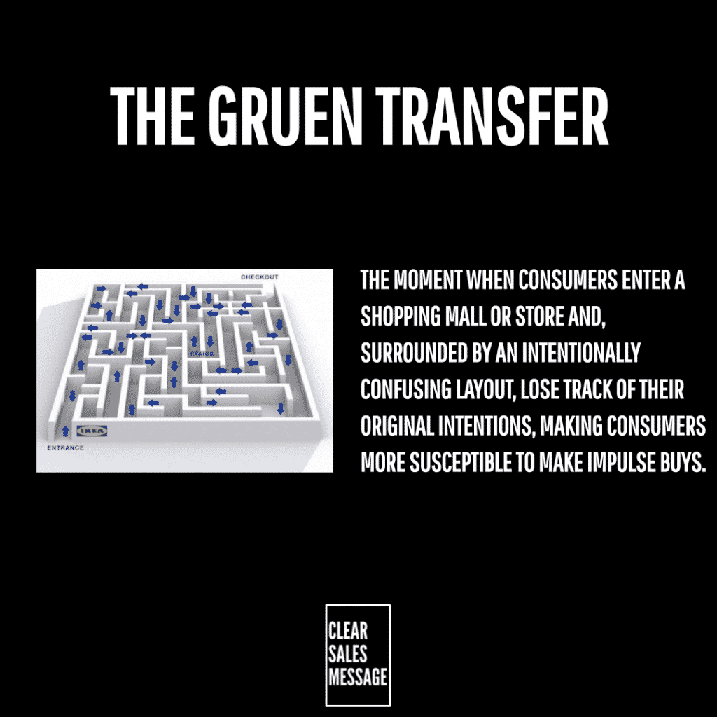
The Gruen Transfer is the reason IKEA stores are so hard to navigate. Everything is laid out to confuse your path and ensure you see as much merchandise as possible.
Why does it work?
It works because you are literally exposed to more merchandise than you intended to be. It’s a tricky thing to use as it can annoy buyers, certainly IKEA are famous for it and people share “shortcuts” to avoid seeing everything in the store. It works simply because it “discombobulates” you so you have to follow a set path to find your way out the store. You can’t just nip in and out of an IKEA for the specific thing you want.
How can you use it?
This ONLY works for physical spaces. On a website having such confusing navigation would drive your visitors away at breakneck speed.
If you own a physical space, how could you curate the buyers’ physical journey so they see everything you have, but that it’s as curated as possible to be beneficial (and not annoying) to that person. IKEA is curated into the parts of the home, how could you curate your offering in a similar, logical fashion?
Example:
A local garden centre restructured its store layout so that customers must pass through a winding path starting with high-margin seasonal flowers, then into garden tools, before reaching the compost and plant food at the back (which is what most customers come for).
Why it works:
Customers often discover something they didn’t know they wanted – like decorative pots or novelty seed kits – simply because they’re funnelled past them. The layout maximises exposure to impulse-buy items before the customer reaches their original goal.
See also


