

Practical Sales Training™ > How To Get Attention > The Adapted Logo Effect
The Adapted Logo Effect
Your logo is not just a symbol. It is a shortcut. Buyers see it and instantly know who you are. The Adapted Logo Effect uses that recognition as a foundation, then adds something on top of it.
When you alter your logo for a specific moment or message, buyers notice the change against the familiar backdrop. Recognition happens first. Then the new message lands. And because the brand is already trusted, the message gets a warmer reception than it would standing alone.
The Adapted Logo Effect means modifying your logo to convey a message. The key is keeping enough of the original for instant recognition.
What Is The Adapted Logo Effect?
We see brands as fixed things. When they move, we pay attention. That is the core mechanism. A brand that adapts its logo signals something worth noticing: an event, a value, a moment in time.
Because the recognition comes first, buyers do not have to work out who is communicating. They already know. So all of their attention goes to the message. That is far more efficient than starting from scratch with an unfamiliar piece of communication.
There is also a personality effect. A brand that can meaningfully adapt its logo appears more alive and more interesting than one that never changes. Over time, these moments build a sense of the brand having a character beyond its colours and shape.
Why Does The Adapted Logo Effect Work?
Logos carry trust. That trust is built up over time through consistent use, and buyers transfer it to whatever message sits alongside the logo. When you adapt the logo to carry a specific message, that trust travels with it.
With the rise of the Google Doodle, buyers have become more comfortable with brands as fluid things. The idea that a logo can shift for a moment without losing its identity is now widely accepted. So the Adapted Logo Effect has a ready audience.
It also creates a sense of occasion. A logo that changes for a specific event signals that the event matters. Because the brand has bothered to acknowledge it, the moment feels bigger than it might otherwise. That is a powerful way to connect with an audience at the right time.
How Can You Use The Adapted Logo Effect?
Start by thinking about the occasions, values, or messages worth adapting your logo for. Seasonal moments, causes you support, milestones, product launches. Each of those is a reason to flex the brand in a way that feels connected rather than random.
Choose the Right Method
Consider the method. A colour change, a font tweak, or a word substitution. Adding an element to the existing mark also works well. The adaptation should be obvious enough to notice but not so radical that the original brand disappears. Recognition is the whole point. Stay close enough to the original that the two are linked at a glance.
Use Language as Well as Visuals
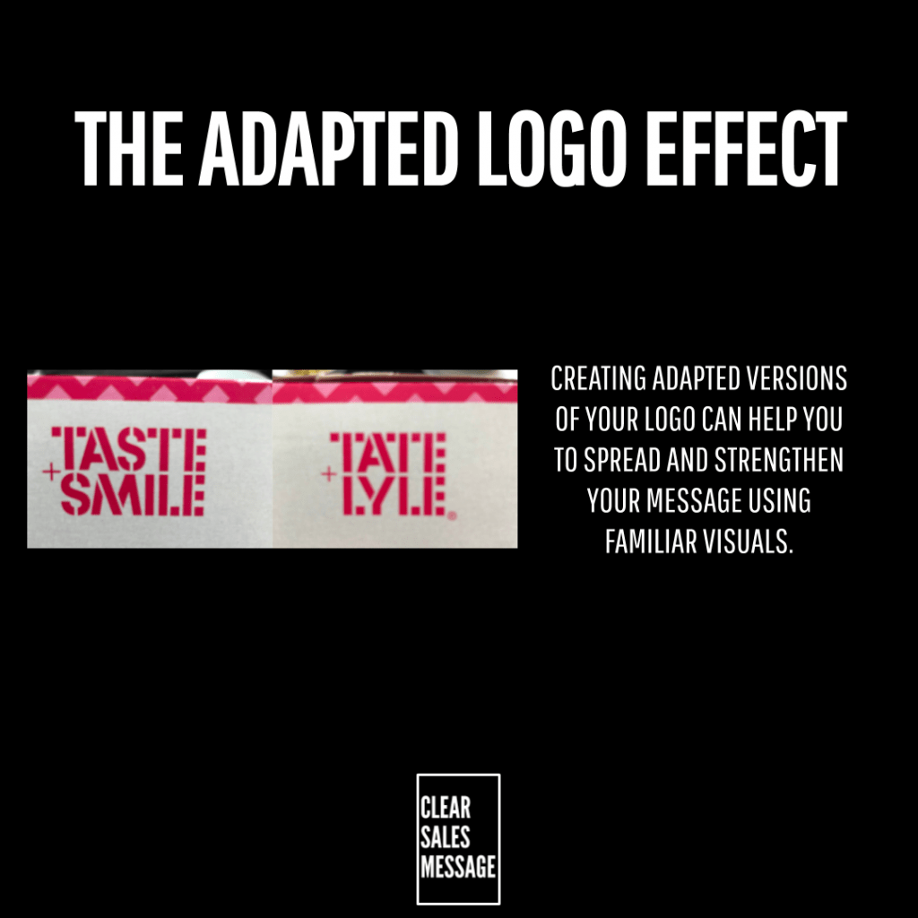
Depending on your offering, think about how you could adapt your brand name or logo style to incorporate positive feelings or actions your buyer will appreciate. In the UK, the sugar brand Tate and Lyle use the phrase “Taste and Smile” on their packaging in the same visual style as their logo. It is not their real name. But it borrows the authority of the brand to deliver a warm message about the experience of baking. Buyers read the brand first and the new message second.
Tie the Adaptation to a Moment
The strongest adaptations have a clear reason behind them. A charity campaign, a seasonal event, a product launch, a cultural moment. When the adaptation and the occasion are obviously connected, the message lands cleanly. When they are not, it looks like a design choice with no meaning behind it.
When The Adapted Logo Effect Works Best
The Adapted Logo Effect works best when the link between the adaptation and the brand message is clear. A colour change to support a cause that aligns with your values reads well. That same colour change with no explanation reads as noise. The adaptation needs to mean something.
It also works well when the adaptation is seasonal or time-limited. Because the change is temporary, it creates a moment rather than a permanent shift. Buyers notice it, engage with it, and move on. When it returns the following year, it feels like a welcome tradition.
It is also effective for brands that want to show they have values beyond selling. When a brand adapts its logo to acknowledge a cause or a cultural moment, it signals awareness of the world beyond its own product. That kind of brand personality is hard to manufacture and easy to appreciate.
When The Adapted Logo Effect Becomes Dangerous
The main risk is confusing buyers. If the adaptation strays too far from the original, buyers may not connect the two. The whole effect depends on recognition happening before the new message lands. When it does not, the communication loses its foundation and the message has to work twice as hard.
There is also a risk of doing it so often that it loses impact. When every week brings a new logo variation, the effect of any single one diminishes. Save adaptations for moments that genuinely warrant them. Scarcity gives each one more weight.
Common Adapted Logo Effect Mistakes
Adapting the Logo Without Changing Anything Around It
The most common mistake is adapting the logo without changing anything else around it. A tweaked logo sits in a context. When the rest of the communication stays generic, the adapted logo looks like a design exercise, not a message. The adaptation should be part of a broader moment, not just a visual flourish.
Adapting Without a Clear Reason
A second mistake is adapting without a clear reason. When a buyer sees an altered logo and has no idea what it is for, they feel puzzled, not engaged. Always have a reason. State it if necessary. The meaning behind the change is what makes it land.
Overdoing It
A third mistake is adapting so regularly that the changes stop registering. When every week brings a new version, the logo loses its fixed identity and the adaptations lose their power to surprise. Treat each adaptation as a considered decision, not a default. The rarer they are, the more each one lands.
The Adapted Logo Effect – An Example
Google runs its Doodle programme on key dates throughout the year. Its homepage logo transforms to reflect a holiday, a cultural event, an anniversary, or a significant figure. The brand stays instantly recognisable throughout. But the adaptation signals that today is different and that this moment matters. Because the doodle is often interactive or animated, it turns a passive logo into an active experience.

That is the full potential of the Adapted Logo Effect. The brand provides the trust. Your adaptation provides the message. Together they create something more engaging than either could deliver alone.
See Also