Practical Sales Training™ > How To Get Attention > Data Visualisation

What is it?
If you have important facts and figures relating to your offering, creatively visualising them can help to seize buyer attention.
Why does it work?
It works because as we scan the websites we visit and documents/emails we read in an F shape, we’re looking for the thing that will help us to understand the nature of the communication. Data visualisation is a variant of semiotics where we visually communicate our message as well as using concise, simple language.
How can you use it?
Consider the important facts and figures for your offering – what would your buyers actually care about?
With those figures in hand, then consider how to visualise the data, there are a couple of ways you can do it:
A simple infographic or graph
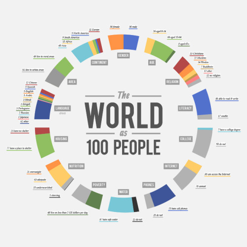
Using a classic infographic like this:
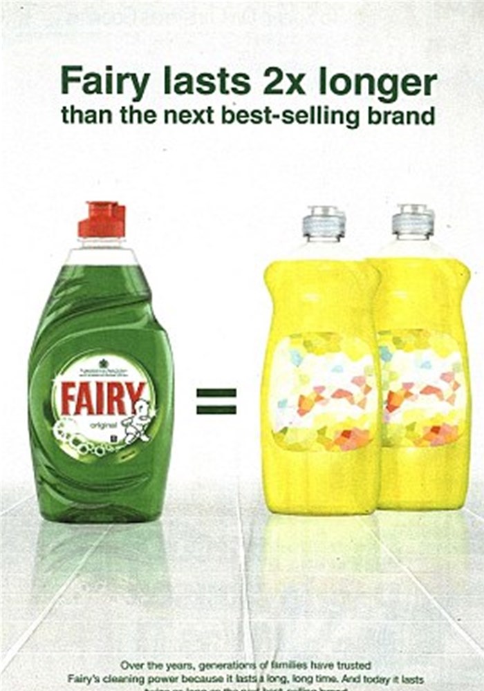
A side by side comparison
How does your offering compare to the competition?
An equivalent comparison
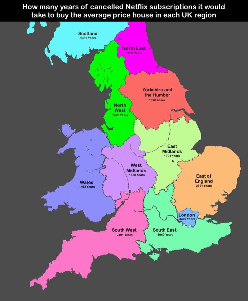
The number of years you need to cancel Netflix to afford a house deposit for example:
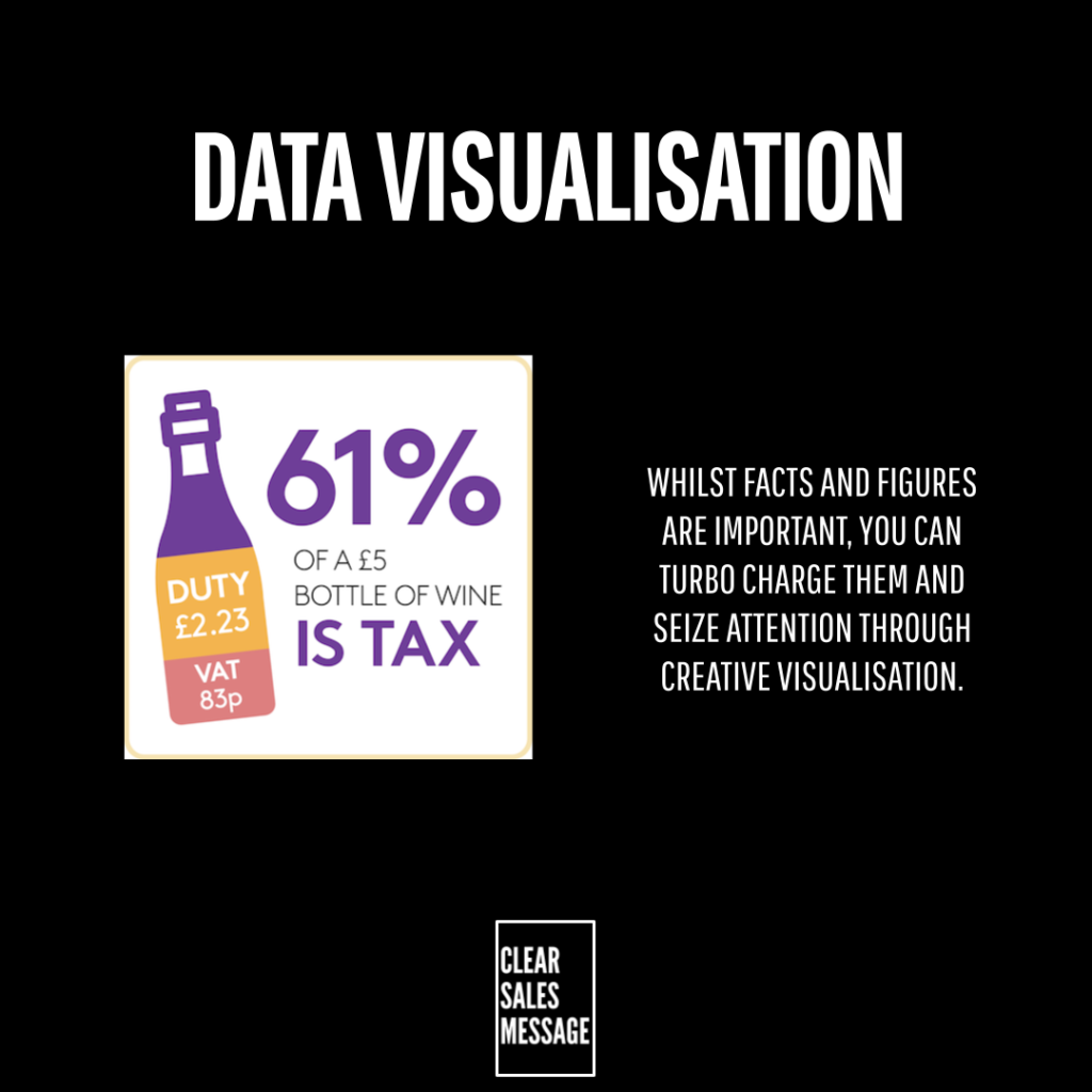
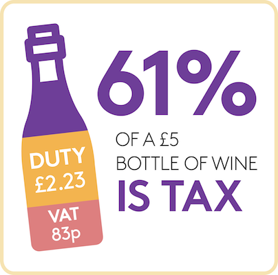
A “breakdown” of something (such as the bottle of wine)
You can show what something “is made of” as a visualisation of the whole object.
You can also show the number of occurrences/probability of something lke this Prostate Cancer advert.

See also
- Diagram Effect
- Facts and Figures Effect
- 100+ ways to seize buyer attention
- 100+ ways to be more memorable