

Practical Sales Training™ > How To Get Attention > The Font Effect

The Font Effect
Most brands use the same handful of safe fonts. So when something looks different, your eye catches it instantly. That’s the font effect at work.
What Is It
The font effect means using a modified or original font to make your offer more memorable. Instead of a generic typeface, you use lettering that people haven’t seen before. That difference sticks in the mind.
Why Does It Work
It works because we’re wired to notice things that stand out. This is sometimes called the Von Restorff effect. When a font looks unfamiliar, it grabs attention first.
That attention doesn’t stop there though. Once something catches your eye, it’s also easier to remember later. So an unusual font does two jobs at once. It gets noticed, and it stays noticed.
How Can You Use It
Think about your own logo or visual communications.
Create Or Modify A Font
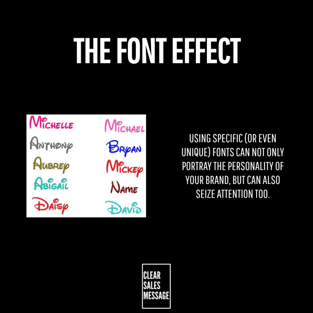
Big brands like Disney built their own custom lettering. You don’t need a full custom font though. Even a modified version of an existing one can carry the same effect.
Use It Consistently
Once you pick your font, use it everywhere. Your logo, your packaging, your signage. Repetition is what turns a font from noticeable into recognisable.
When It Works Best
This works best when you plan to use the font for years, not months. A font needs time and repetition to build real recognition.
It also works well for brands that rely on quick visual recognition, like retail, food, or drink. In those markets, a glance is often all you get.
When It Becomes Dangerous
A unique font can backfire if it’s hard to read. If people struggle to make out your words, the attention you win turns into confusion instead.
It’s also risky if you change your font often. Every switch resets the recognition you’ve built, so consistency matters more than novelty here.
Common Mistakes
Choosing Style Over Readability
A font that looks clever but reads poorly loses the whole point. Always test it at a glance, not just up close.
Changing It Too Often
Switching fonts regularly stops recognition from building. Pick one, and stick with it long enough for it to actually work.
The Font Effect – An Example
Coca-Cola’s Script Has Barely Changed Since The 1800s
Coca-Cola uses a distinctive script font in its logo. It’s remained almost unchanged since the late 1800s. That single choice grabs attention instantly, even from a distance.
Because the lettering is unique to Coca-Cola, it stands out from every generic typeface around it. That builds memorability, and it reinforces the brand every time someone sees it. This is the font effect working exactly as intended.


See also